Here are some CSS resets that I have been using on all of my stylesheets of late that take into modern workflows like responsive design and CSS3 usage. Unless otherwise noted, I’ve left out vendor prefixes for simplicity.
A Few Notes
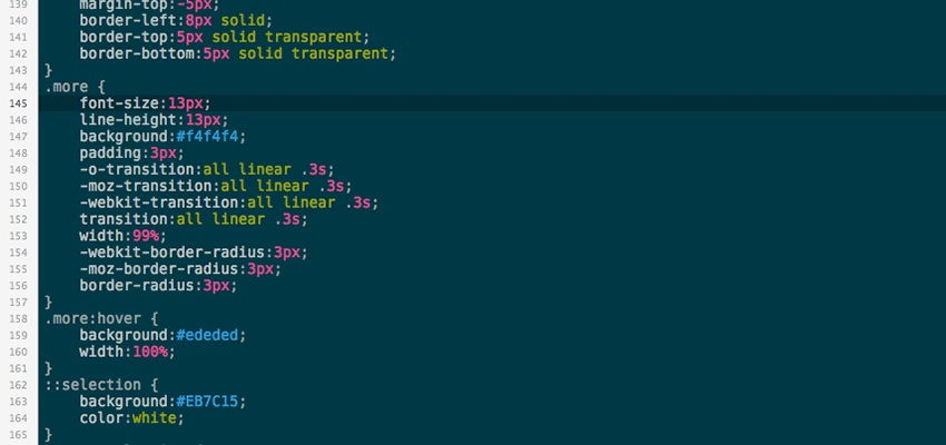
Reset
Since I prefer to set my own vertical rhythm, I’m a fan of the very simple margin:0 and padding:0 reset that Chris Coyier has made popular. Border-box is another no-brainer that deserves to be used on the universal selector (sounds like some kind of New Age thing doesn’t it? The Universal Selector Theory of Life or something).
Transitions
It’s nothing new but I think subtle transitions on all anchor links adds a touch of class to the user experience. The important thing for me when doing this is the transition:none on the active state. When a user clicks on a link or button, the active state should be crisp and responsive, like you would expect when pressing down a button in real life.
Buttons
My main concerns with buttons are that they are a) inline-block, and b) have -webkit-appearance:none applied to them. Inline-block allows us more flexibility in terms of alignment, and -webkit-appearance helps us wrangle the styling of our buttons away from the clutches of iOS. Note that I’ve applied transition:none to the :active state as well, following my preference for crisp transitions on click.
Clearfix
I’ve included a clearfix snippet here since they are so useful in modern layouts. Feel free to change the name of the selector to anything (.cf, .clear, whatever).
Responsive Stuff
I’ve included two simple defaults for responsive design without getting too heavy into responsive layouts themselves. The first is the img tag, which at the very least requires a max-width:100%. The second default deals with form elements at smaller screen views. The key here is ensuring that inputs are full width on their own line (hence the width:100%, float:none and display:block), but then restricting checkboxes and radios to width:auto so that their corresponding labels do not get bumped to the next line.
About the Author: David Ryan
David is an experienced web designer and WordPress developer who runs Healing Arts Web, offering quality custom websites to small businesses and teachers. He is also a musician, avid disc golfer and espresso enthusiast.
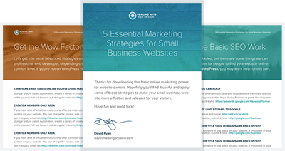
Free Download:
5 Essential Marketing Strategies for Small Business Websites